Monday, April 19, 2010

Type Visualization


Here's my treatment of the word "grow". I hope that it inspires some of you to go out and grow something when you get home from school! I enjoyed making this so much I did a few other logos as well. These treatments of "hyper" and "remember" were very quick ideas, but I thought I'd post them as well.


Thursday, April 15, 2010

Whitney Biennial


Both of the works I chose to compare from the Whitney Biennial were actually from the retrospective of past biennials on the top floor. Milton Avery's oil painting from 1956, titled Sea Gazers, was a perfect piece to compare and contrast with Richard Diebenkorn's Girl Looking at Landscape exhibited two years following. Both artists have been included in numerous Whitney Annuals and Biennials It was very interesting to see a very similar subject matter, namely a view of a landscape with figure(s), handled in two different painting styles as well as from two different physical viewpoints. While both paintings also have a human element, they, too, are treated uniquely.
In Diebenkorn's Girl Looking at Landscape we are intimate with the woman looking out the window, invited to share her view of the verdant scene beyond. In Avery's work, Sea Gazers,
the people are in the landscape and we are viewing them as well as the seascape they enjoy. Despite these differences, both paintings have a feeling of casual calm. The relaxed pose of the woman in Diebenkorn's work and the soft colors of Avery's piece each contribute this feeling of contentment.
The size of the two works also contributes to their varying impact on the viewer. While Avery's piece is somewhat small at 30" 44", Diebenkorn's is a much larger painting (approximately 3' x 4'). Becasue of this, I definitely noticed Diebenkorn's work first, but the soft colors and simple composition of Avery's piece drew me in slowly. While both artists tend to simplify the real world when they paint, they also succeed in capturing the essence of a scene. I am reminded of Florian Maier-Aichen's method of deconstructing the photographs he takes. Indeed, Avery is quoted as saying "I always take something out of my pictures. I strip the design to the essentials."

Tuesday, April 13, 2010

Collaborative Presentation Exhibit: Landscapes of the Mind


How an artist's real world influcences the alternative realities in his art

This exhibit brings together three artists, Florian Maier-Aichen. Oliver Wasow and George Grie who each create alternate realities through the use of digitized media.

While Wasow and Maier-Aichen begin with a photograph, Grie starts with an image from his mind. Each artist has unique intentions about what he wants the viewer to take away from his images. This also varies the degree to which each artist's work compares to the real world.


Use the following links for more artist information:


Tuesday, April 6, 2010

Self-Visualization Project


This project shows three different activities that are an impotant part of my life. It depicts a close up image of an object that is symbolic of each activity combined in Photoshop with an image of myself. The image of me is extremely small in scale compared to the close up image. This serves to show the importance that the activity as in my life, as opposed to how important it is that I am the one doing the activity. My image is also interacting with each object in some way. I used Illustrator to augment the interaction between myself and the object creating a sense of movement. I also used Illustrator to hand draw the text, labeling each panel of the triptych in a playful way to go along with the mood of the images.

Monday, March 15, 2010

When comparing the three artists, Cui Xiuwen, Mairna Abamovic and Frida Kahlo, I find that each brings a measure of pain to their work. At varying levels, they show us that pain in their portraiture. While Abramovic, dubbed “The Queen of Pain” by one art critic, is known for her intentional forbearance of self-punishing performances, Frida Kahlo suffered uninvited and serious physical pain for most of her life. Kahlo’s self-portraits often elicit a sympathetic response of pain from viewers as she puts the inadequacies of her body on display. Cui Xiuwen seems more lighthearted than the others, given her more recent work of pale pastel portraits of young pregnant girls. Her earlier works, however, display a pain from the oppression of political regimes in her images of battered schoolgirls.

When Abramovic endured difficult times in her actual life, she chose to document their impact on her life. When she and her soon to be ex-husband were divorcing, they performed their separation by walking 2000 kilometers toward each other on the Great Wall of China to say goodbye. In this piece as in others, she seeks to endure a hardship to come out stronger and wiser. I see in her work a longing for some hard to reach goal. These strivings she presents in performances that are portraits of the feelings she undergoes, such as those in The Lips of Thomas, in which she alternately cuts, flagellates, and freezes herself. She seems to want the audience to think about what she is going through and feel her experience. In speaking about the recent economic difficulties, Abramovic points out that hard times often result in great art and she pushes herself into this state willingly.

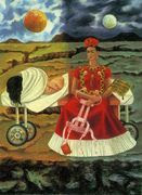
Kahlo, on the other hand has been dealt a lot of suffering and perhaps for her, because it was unbidden, she needs to show it to the world. Her frequent use of death imaery suggest an obsession with dying and contrast to Abramovic’s search for painful experiences. While Abramovic uses actual performance, including many of long duration, Kahlo sums up a host of uncomfortable thoughts and memories in a single painting as in Tree of Hope or Henry Ford Hospital. Her strong colors and use of Mexican folk symbols combine to show us what trouble she’s been through and is still experiencing in regards to her body, her marriage and he conflicted feels about her dual heritage. To me, she is much more straightforward in her imagery than either Abramovic or Xiuwen.

Xiuwen’s Lady’s Room video of prostitutes primping and adjusting themselves in the bathroom of a Beijing disco, implies the pain, both physical and emotional, that comes from the work they do. They are preparing for the encounter with supreme focus, as if preparing for a battle. This pseudo-documentary work also highlights the general difficulty of being a woman in Chinese society. The school girl series, including One Day in 2004, No. 6, seems to indicate hardships borne by the girl(s). The official “Young Pioneers” attire speaks of some kind of authoritarian dictate.

While each shows us what it is to endure pain, all three artists also show us how growth can be gained artistically and personally through the experience of such difficult times. Xiuwen uses the schoolgirl to make us think about growing, as the girls look to be wiser than their years. To me it implies that they have to “grow up” to understand the ills of society. Abromovic often has a triumphant look at the end of one of her pieces, as if she has achieved a transformation. As for Kahlo, perhaps by constantly painting her deepest fears and frailties, she herself grew in her ability to communicate feelings through her artwork.

Thursday, March 11, 2010

Live Trace Illustrator Exercise


Flower Girl


Here's an image I made with live trace. The girl was traced and the colors were altered with live paint after expanding the image. Then I silhouetted her and placed her on top of three different versions of a flower garden image. The flower garden was created with three different variations of live trace, the middle version being altered with live paint as well.

Monday, February 15, 2010

Photo Alteration


The concept for this project was to show a connection between my daughter and myself in a fantasy sort of scene, while implying a true connection in our present lives. I was inspired by the exhibit on Inherited Traits, particularly The Nightgown Pictures, as it showed connection between family members despite the passage of time though generations. While that work seems more direct in its portrayal of such connections, the piece I created is meant to be more elusive and open-ended. Varying interpretations of this image by viewers may suggest different connections between the two figures in the image.

Tuesday, February 2, 2010

Photo Alteration


I plan on combining the interior image of my daughter in a Alice in Wonderland type interaction with my younger self. The mirror will contain images of myself as a child in an outdoor winter scene.


Thursday, January 28, 2010

Comments on Blogs about Four Artists

I found it interesting to see that people chose many different images of these artists to accompany their comments. It just goes to show how differently people can respond to the same artwork. It was nice to see that everyone seemed to enjoy Hocks humor, while several recognized the irony and frustration inherent in the images. I guess it's like watching Wile E. Coyote getting blasted - you laugh, but you can also relate on some level to something that "blew up" in your own life.
Bryan's noted Jeff Wall's contention that ideas are not always best communicated through visuals, despite the old saying about 1,000 words. As Bryan expressed, I also enjoyed Hocks' fusing of media.
Adri's comments were very well thought out. I also noticed Jeff Wall's use of distance. I appreciated that she showed us another very different piece by Sherman. Crewsdon implied Magritte for me also.
Amy 's discussion of the sizes of the works was interesting as I had allowed the format of the computer to cloud my perception of the actual sizes of the works.
Ceire's point not to separate an artist's writings from his/her art was a good one and went along with what Bryan was saying (see above).
Lizz's comment about Sherman's stills and their voyeristic feeling was something I also experienced. I think this only makes sense since these are meant to represent movies and one is often a voyeur when watching a film.
Elle's mention of the layers in Crewsdon's work makes me think of Photoshop!
Katie's comment about Wall's work feeling candid, when in fact it is always staged was something I also felt when viewing his work.
Lots of excellent observations!

Monday, January 25, 2010

Four Digital Artists to Consider

My impression of the artists Cindy Sherman, Teun Hocks, Jeff Wall and GregoryCrewsdon is that they all create a very stylized view of the world. Each uses what are sometimes complex and at the least, very carefully thought out, methods to create their images. When I think of more traditional photographers, I think of Cartier-Bresson's "decisive moment" and how different that way of working is from the way these artists are creating. This is not to say that they are not inspired in a serendipitous way by other images or scenes they see.

Cindy Sherman's work is clearly based on the films she has seen and the stills made from, but her process seems much more laborious than the quick captures of a film frame. I like the way it feels as if you've seen the image before, but you haven't. She's just captured the feel and look of a similar scene so well that the eye and memory are fooled.

As for Crewsdon, he says he sometimes has crews of 35 people working on the scenes he creates. That's a lot of detail work! This is why I say their work overall seems stylized, not necessarily because the scenes are implausible or unrealistic, but because of all the effort that is put into fabricating the "moment". Crewsdon's work is much sadder than Hocks' and one can feel the sense of isolation in many of his pieces. He uses light very effectively to guide the viewer's eye to his intended point of focus.

Jeff Wall's work, while also very staged, somehow seems to have more interaction between the subject (even when it's himself!) and the photographer as the people in his photographs are often engaging the viewer with their gaze. Even when they're not looking at the camera, the viewer feels he/she is there in the scene. Some of his work has a very 80s feel to me. I don't quite understand the use of the lightbox, but perhaps if I viewed a work in person I would find it contributes.

I found Tuen Hocks work to be very humorous and enjoyed the fact that he uses himself in every photo. Unlike Cindy Sherman, you know it's him. I can't help but think of Magritte here with all the bowler hats and the surrealistic feel to his work. I love the hand coloring and the way he alters the feeling of the piece with color.